
 Apr 5, 2003 - 4:12 PM Apr 5, 2003 - 4:12 PM
|
 
|
 Enthusiast  Joined Jan 30, '03 From Virginia Currently Offline Reputation: 0 (0%) |
I was looking around the site when I thought about banners. You know, advertising and all. I don't know if we have any or anything, maybe we do. But, I thought that maybe people who design pictures and stuff could have a contest. A someone could judge and maybe the top have like a top 5 or something. On top of that, we could use the banners in our sigs on other sites in order to promote this site. What do y'all think?
|

 |
Replies
(1 - 13)
|
Apr 5, 2003 - 7:34 PM
|
|
 Enthusiast Joined Jan 5, '03 From Bay Area Currently Offline Reputation: 0 (0%) |
 What do you think? |
|
Apr 5, 2003 - 7:49 PM
|
|
|
Enthusiast Joined Jan 16, '03 From Wichita KS Currently Offline Reputation: 0 (0%) |
noobone is that a curren with silvia headlights, Just curious because thats phat.
|
|
Apr 5, 2003 - 8:02 PM
|
|
|
Enthusiast Joined Jan 30, '03 From Virginia Currently Offline Reputation: 0 (0%) |
Dude. That is the bomb! Sweet, man. So, you wanna do this contest too? Come on people, we need more opinions/participants!!!
|
|
Apr 5, 2003 - 8:07 PM
|
|
 Administrator Joined Aug 23, '02 From Seattle, WA Currently Offline Reputation: 14 (100%) |
I'll make one in a few minutes. This will be fun, and it's an excellent idea!

-------------------- New Toyota project coming soon...
|
|
Apr 5, 2003 - 9:01 PM
|
|
||
|
Enthusiast Joined Jan 9, '03 From Concord, NC Currently Offline Reputation: 0 (0%) |
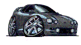
thats nice but it could give people the wrong impression of the site, considering it takes a second to look at to figure out it is a curren. I honestly thought you just slapped in a pic of a silvia. This post has been edited by hiflytsi: Apr 5, 2003 - 9:02 PM |
||
|
Apr 5, 2003 - 10:56 PM
|
|
|
Administrator Joined Aug 23, '02 From Seattle, WA Currently Offline Reputation: 14 (100%) |
After getting distracted for a couple hours, I finished up a design for my banner. Here it is, in standard size(468x60 pixels) in non-animated GIF file format.
1. This one is my favorite. It is the largest of the four banners, weighing in at 13,048 bytes.  2. This is a variation of the first one, this time with the cars in grayscale. This banner is 11,289 bytes.  3. This is another banner with grayscale cars, this time with no slight projector lights background. This one is the smallest of them all at 8,373 bytes.  4. This is another banner with the cars in blue, and once again with no background. This one is 10,484 bytes.  Lemme know what you guys think, and let me know which is your favorite.  If you've got any suggestions or ideas, let me know and I'll see what I can do. If you've got any suggestions or ideas, let me know and I'll see what I can do. These pics are not in a permanent location, so if you're going to use them, please save them to your computer and upload them, rather than referencing them from these image locations, because if you do that, they won't work in the future. Once we decide on some final banner designs, I will put them in a dedicated, permanent location and post locations of the images on the site. -------------------- New Toyota project coming soon...
|
|
Apr 5, 2003 - 10:59 PM
|
|
|
Enthusiast Joined Jan 30, '03 From Virginia Currently Offline Reputation: 0 (0%) |
I like the first two just fine. While the blue is my favorite of the two, the second one with greyscaled Celicas might match any future site design.
|
|
Apr 6, 2003 - 12:47 PM
|
|
|
Moderator Joined Oct 1, '02 From fall river, ma Currently Offline Reputation: 13 (100%) |
hey commer, they all look good....the first one is my fav...
-------------------- Former Team 5SFTE pro member ;)
 13.6@108MPH, 5SFTE Powered |
|
Apr 6, 2003 - 12:55 PM
|
|
|
Enthusiast Joined Oct 13, '02 From Blairstown, New Jersey Currently Offline Reputation: 6 (100%) |
Second one looks great!!

-------------------- 3rd gen ST205 3SGTE - Alive and boosting. |
|
Apr 8, 2003 - 4:57 PM
|
|
 Enthusiast Joined Aug 30, '02 From Franklin,Tn Currently Offline Reputation: 0 (0%) |
1st or 2nd get my vote. Its going up on my Cardomain page.
Bryan |
|
Apr 8, 2003 - 5:16 PM
|
|
|
Enthusiast Joined Jan 30, '03 From Virginia Currently Offline Reputation: 0 (0%) |
I made one, but I gotta wait for my hosting site to start working good again.

|
|
Apr 8, 2003 - 7:02 PM
|
|
|
Enthusiast Joined Mar 21, '03 From San Jose, CA Currently Offline Reputation: 2 (100%) |
Coomer, my two cents may not count as much for being new to the site, but I vote for the second banner. The "6G Celicas" stands out more and cars in grayscale gives the title a better frame and makes it easier on the eyes. With the slight projector lights in the background it gives it a nice flow/connection from left to the right of the banner.
With the first banner, you loose the title abit - too much blue. --------------------  a.k.a. Lolo (Norcalcelicas.org/Newcelica.org) |
|
Apr 8, 2003 - 9:09 PM
|
|
||
 Enthusiast Joined Feb 17, '03 From Adelaide, South Australia Currently Offline Reputation: 0 (0%) |
I agree, the first one is too blue. The second one is better because it makes the title stand out better. Three and four look boring, nothing in the background. |
||
 |
1 User(s) are reading this topic (1 Guests and 0 Anonymous Users)
0 Members:
| Lo-Fi Version | Time is now: May 24th, 2026 - 4:37 PM |