
 Jun 16, 2006 - 10:11 PM Jun 16, 2006 - 10:11 PM
|
 
|
 Administrator  Joined Aug 23, '02 From Seattle, WA Currently Offline Reputation: 14 (100%) |
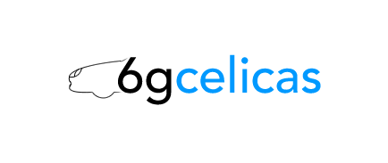
I'm considering redesigning the 6G Celicas logo for use on the site.
A new logo would have to be vector-based primarily for use both in print and on a computer screen, and I want something simple yet classy. I messed around in Fireworks for a while today and here's what I ending up coming up with. There are a few different examples. Let me know what you think. 
Attached image(s)
-------------------- New Toyota project coming soon...
|

 |
Replies
|
Jul 16, 2006 - 2:41 AM
|
|
 Enthusiast Joined Feb 22, '03 Currently Offline Reputation: 0 (0%) |
no offense but i dont like any of em. a logo should be somethin a lot more bold and somethin that stands out from anything else. a logo for a car especially should lean more towards an icon/symbol. your designs look too genetic, and not what you would normally see for car logos. all your designs are clean but dont pop. thats just my opinion though.
and yes, i am a graphic designer so i do know a lil bit about corporate identity. once again this is just an opinion. and id stay away from that whole shark motif considering that Tiburon means shark in spanish or something. So the shark idea would be misinterpreted for another car probably (Hyundai Tiburon). -------------------- Note to new members. Discussions such as the ones below are forbidden.
http://www.6gc.net/forums/index.php?showtopic=26310&hl= |
Posts in this topic
 Coomer Played around with creating a new 6GC Logo today Jun 16, 2006 - 10:11 PM
 TheStreetzKing i like the bottom ones, red stands out the best, m... Jun 16, 2006 - 10:37 PM defgeph Last one looks nice, the additional line makes it ... Jun 16, 2006 - 11:22 PM j0e_p3t i think they look alright. i'm so used to the ... Jun 17, 2006 - 1:22 AM hitcachi I think we should go what celica tech did and have... Jun 17, 2006 - 2:05 AM presure2 chris,
imma be the d*ck on this one, and say i don... Jun 17, 2006 - 8:32 AM phonex98 i personally like the thrid one, with the blue bac... Jun 17, 2006 - 11:23 AM Akimbo I like the last one however I think it is almost t... Jun 17, 2006 - 12:26 PM Kadett Agreeing with manny on this one. Font to plain/sim... Jun 17, 2006 - 2:29 PM LewFX put the 6 as a wheel in that car icon Jun 17, 2006 - 2:47 PM dustinkemp i like the original the best Jun 17, 2006 - 7:19 PM CelicaZR I agree with Manny about the definition to the fro... Jun 17, 2006 - 8:00 PM jgreening I like the simple design.
My biggest problem with... Jun 17, 2006 - 11:16 PM Batman722 I misunderstood, sorry. Jun 18, 2006 - 2:25 AM doGGy There is nothing better then the old Plain logo Ch... Jun 18, 2006 - 7:26 PM Coomer Hmm...perhaps I should have been more clear. I pla... Jun 18, 2006 - 9:37 PM celicurr #3 for sure! I'm liking the blue as well Jun 18, 2006 - 11:51 PM presure2 ahhh..now i get it..lmao
in that case, i like #3 ... Jun 19, 2006 - 6:49 AM Kadett Now I get it,
Number 5 it is Jun 19, 2006 - 9:18 AM bojangles_8686 #3 All the way Jun 19, 2006 - 10:29 AM snapshotgt #5
~snap Jun 19, 2006 - 3:59 PM LewFX is it possible to see the wordage moved over to th... Jun 19, 2006 - 7:27 PM XS4lv1Truch0x for logo do u mean like the sticky thing that gets... Jun 20, 2006 - 1:46 AM vincent_doggy How about use cursive for the word celica? Jun 20, 2006 - 2:56 AM Supersprynt QUOTE(XS4lv1Truch0x @ Jun 20, 2006 - 2... Jun 20, 2006 - 3:25 PM XS4lv1Truch0x i think the celica dragon would look good by the e... Jun 20, 2006 - 10:53 PM beastman I think #5 looks really good! Jun 21, 2006 - 9:19 AM BlackCelicaGT94 I like number 5 but im not a fan of the stars - re... Jun 21, 2006 - 11:28 AM WALKER I like #3, I like the white text on a colored back... Jun 21, 2006 - 2:51 PM WH95TE They arent very good lol, but I was bored. Jun 24, 2006 - 2:22 AM 94st_santos I think you should use the background in #3 and th... Jun 24, 2006 - 8:51 AM LewFX celicatech is having a contest, we could too for a... Jun 25, 2006 - 3:13 PM JFrost9 I like the #3, i think you should add the text fro... Jun 25, 2006 - 7:31 PM x_itchy_b_x new designs look very imac ipod mac inspired to me... Jun 27, 2006 - 1:34 AM Rayme Look too much volkswagen-ish with those futura fon... Jun 27, 2006 - 8:10 AM MaskedMan I like #5 #5!
Celica's look like shark... Jul 9, 2006 - 12:21 AM CelicaBuddy ^^^
I'm not a big fan of the star look but I... Jul 12, 2006 - 8:35 PM Consynx turn the G into a turbo.
wrap the bottom around co... Jul 15, 2006 - 9:37 PM devilsden97 ^ id have to agree, something along that line coul... Jul 15, 2006 - 9:39 PM MaskedMan the shark thing was just a joke cuase i was bored.... Jul 16, 2006 - 4:49 AM
TheStreetzKing i like the bottom ones, red stands out the best, m... Jun 16, 2006 - 10:37 PM defgeph Last one looks nice, the additional line makes it ... Jun 16, 2006 - 11:22 PM j0e_p3t i think they look alright. i'm so used to the ... Jun 17, 2006 - 1:22 AM hitcachi I think we should go what celica tech did and have... Jun 17, 2006 - 2:05 AM presure2 chris,
imma be the d*ck on this one, and say i don... Jun 17, 2006 - 8:32 AM phonex98 i personally like the thrid one, with the blue bac... Jun 17, 2006 - 11:23 AM Akimbo I like the last one however I think it is almost t... Jun 17, 2006 - 12:26 PM Kadett Agreeing with manny on this one. Font to plain/sim... Jun 17, 2006 - 2:29 PM LewFX put the 6 as a wheel in that car icon Jun 17, 2006 - 2:47 PM dustinkemp i like the original the best Jun 17, 2006 - 7:19 PM CelicaZR I agree with Manny about the definition to the fro... Jun 17, 2006 - 8:00 PM jgreening I like the simple design.
My biggest problem with... Jun 17, 2006 - 11:16 PM Batman722 I misunderstood, sorry. Jun 18, 2006 - 2:25 AM doGGy There is nothing better then the old Plain logo Ch... Jun 18, 2006 - 7:26 PM Coomer Hmm...perhaps I should have been more clear. I pla... Jun 18, 2006 - 9:37 PM celicurr #3 for sure! I'm liking the blue as well Jun 18, 2006 - 11:51 PM presure2 ahhh..now i get it..lmao
in that case, i like #3 ... Jun 19, 2006 - 6:49 AM Kadett Now I get it,
Number 5 it is Jun 19, 2006 - 9:18 AM bojangles_8686 #3 All the way Jun 19, 2006 - 10:29 AM snapshotgt #5
~snap Jun 19, 2006 - 3:59 PM LewFX is it possible to see the wordage moved over to th... Jun 19, 2006 - 7:27 PM XS4lv1Truch0x for logo do u mean like the sticky thing that gets... Jun 20, 2006 - 1:46 AM vincent_doggy How about use cursive for the word celica? Jun 20, 2006 - 2:56 AM Supersprynt QUOTE(XS4lv1Truch0x @ Jun 20, 2006 - 2... Jun 20, 2006 - 3:25 PM XS4lv1Truch0x i think the celica dragon would look good by the e... Jun 20, 2006 - 10:53 PM beastman I think #5 looks really good! Jun 21, 2006 - 9:19 AM BlackCelicaGT94 I like number 5 but im not a fan of the stars - re... Jun 21, 2006 - 11:28 AM WALKER I like #3, I like the white text on a colored back... Jun 21, 2006 - 2:51 PM WH95TE They arent very good lol, but I was bored. Jun 24, 2006 - 2:22 AM 94st_santos I think you should use the background in #3 and th... Jun 24, 2006 - 8:51 AM LewFX celicatech is having a contest, we could too for a... Jun 25, 2006 - 3:13 PM JFrost9 I like the #3, i think you should add the text fro... Jun 25, 2006 - 7:31 PM x_itchy_b_x new designs look very imac ipod mac inspired to me... Jun 27, 2006 - 1:34 AM Rayme Look too much volkswagen-ish with those futura fon... Jun 27, 2006 - 8:10 AM MaskedMan I like #5 #5!
Celica's look like shark... Jul 9, 2006 - 12:21 AM CelicaBuddy ^^^
I'm not a big fan of the star look but I... Jul 12, 2006 - 8:35 PM Consynx turn the G into a turbo.
wrap the bottom around co... Jul 15, 2006 - 9:37 PM devilsden97 ^ id have to agree, something along that line coul... Jul 15, 2006 - 9:39 PM MaskedMan the shark thing was just a joke cuase i was bored.... Jul 16, 2006 - 4:49 AM tranthecelicaman QUOTE(MaskedMan @ Jul 9, 2006 - 12:2... Jul 17, 2006 - 3:26 PM
 |
1 User(s) are reading this topic (1 Guests and 0 Anonymous Users)
0 Members:
| Lo-Fi Version | Time is now: June 26th, 2026 - 3:20 AM |