
 Mar 31, 2007 - 2:18 PM Mar 31, 2007 - 2:18 PM
|
 
|
 Enthusiast  Joined Mar 26, '07 From CP 518 Currently Offline Reputation: 0 (0%) |
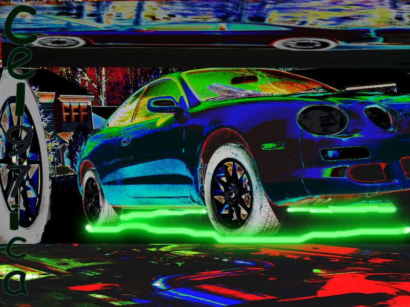 what do you think about it? --------------------  |

 |
Replies
|
Apr 3, 2007 - 12:25 AM
|
|
|
Enthusiast Joined Nov 30, '04 From Atlantic City Currently Offline Reputation: 21 (100%) |
Not a bad first attempt. here's some pointers from someone who's been doing digital art for a while.
1. rarely is it a good idea to invert colors. usually people will not approve of it and it takes away from the actual detailed work you did. 2. as you get better, stray away from using filters( aside from various blues, and minor artistics), it tends to make an image look cheap and overdone. 3. when doing a font, choose one that fits the mood. make sure the font is on a transparent layer that way you can blend it into the image to give it a better effect. 4. less is best. negative(empty) space isn't a bad thing. also try not to make it a habbit of stretching images in a non proportional way. 5. practice, practice, practice. just keep at it and things will come natural. i hope you don't think i'm being too critical but i figured rather than telling you it's good or bad, i'd explain ways that you can better yourself. -------------------- |

Posts in this topic
 cel97ica my celica collage what do you think Mar 31, 2007 - 2:18 PM
 jdmart looks pretty sweet to me Mar 31, 2007 - 3:49 PM cel97ica for my first i didnt think it was terrible i just ... Mar 31, 2007 - 10:51 PM Dee-No sorry, but it looks horrible Apr 1, 2007 - 3:26 AM
 jdmart QUOTE(Dee-No @ Apr 1, 2007 - 8... Apr 1, 2007 - 7:45 PM bccentaur3 QUOTEsorry, but it looks horrible
LOL, honest ... Apr 1, 2007 - 3:36 AM cel97ica i mean your right better to be honest its my first... Apr 1, 2007 - 12:17 PM jason not bad, i think the inverted colors kinda ruin it... Apr 1, 2007 - 1:04 PM cel97ica thanks Apr 1, 2007 - 7:05 PM cel97ica hahah thanks i did at first too that why i made it... Apr 2, 2007 - 9:51 PM 95st-celica Thats sick Apr 2, 2007 - 10:07 PM mikeismad0408 i think it looks good. Apr 2, 2007 - 11:01 PM DSToyo honestly i think it looks pretty bad. there is too... Apr 2, 2007 - 11:23 PM SxiCeli82 that's so pretty! Apr 3, 2007 - 10:50 AM cel97ica thanks everyone who thinks its good for my first t... Apr 3, 2007 - 2:36 PM DSToyo it is a good first try, i prolly should of said th... Apr 3, 2007 - 2:39 PM cel97ica started to but then stopped i will and you guys le... Apr 3, 2007 - 8:11 PM cel97ica just finished took like 10 min anybetter??? after ... Apr 3, 2007 - 9:26 PM phonex98 QUOTE(cel97ica @ Apr 3, 2007 - 6:26 ... Apr 5, 2007 - 3:37 PM hatchy_gt-s not to bad agreed on the not needin the invert mab... Apr 3, 2007 - 9:30 PM cel97ica 2nd 1 any better? Apr 5, 2007 - 3:23 PM cel97ica thanks for the advice i used corel paintshop pro, ... Apr 5, 2007 - 3:58 PM
jdmart QUOTE(Dee-No @ Apr 1, 2007 - 8... Apr 1, 2007 - 7:45 PM bccentaur3 QUOTEsorry, but it looks horrible
LOL, honest ... Apr 1, 2007 - 3:36 AM cel97ica i mean your right better to be honest its my first... Apr 1, 2007 - 12:17 PM jason not bad, i think the inverted colors kinda ruin it... Apr 1, 2007 - 1:04 PM cel97ica thanks Apr 1, 2007 - 7:05 PM cel97ica hahah thanks i did at first too that why i made it... Apr 2, 2007 - 9:51 PM 95st-celica Thats sick Apr 2, 2007 - 10:07 PM mikeismad0408 i think it looks good. Apr 2, 2007 - 11:01 PM DSToyo honestly i think it looks pretty bad. there is too... Apr 2, 2007 - 11:23 PM SxiCeli82 that's so pretty! Apr 3, 2007 - 10:50 AM cel97ica thanks everyone who thinks its good for my first t... Apr 3, 2007 - 2:36 PM DSToyo it is a good first try, i prolly should of said th... Apr 3, 2007 - 2:39 PM cel97ica started to but then stopped i will and you guys le... Apr 3, 2007 - 8:11 PM cel97ica just finished took like 10 min anybetter??? after ... Apr 3, 2007 - 9:26 PM phonex98 QUOTE(cel97ica @ Apr 3, 2007 - 6:26 ... Apr 5, 2007 - 3:37 PM hatchy_gt-s not to bad agreed on the not needin the invert mab... Apr 3, 2007 - 9:30 PM cel97ica 2nd 1 any better? Apr 5, 2007 - 3:23 PM cel97ica thanks for the advice i used corel paintshop pro, ... Apr 5, 2007 - 3:58 PM |
1 User(s) are reading this topic (1 Guests and 0 Anonymous Users)
0 Members:
| Lo-Fi Version | Time is now: May 17th, 2026 - 12:22 AM |